 I am now in the last stages of my blog-to-book process. I recently got my first view of the interior design of the book, and several months ago I received a copy of the cover design. You might wonder if I had any say over either of these things. No.
When I first saw the cover, I thought, “Hey! Pretty nice!” This was followed by, “Why is the cover light blue? Is it supposed to look like WordPress blue? It doesn’t stand out…It’s kind of muted, not bright and eye catching.” Then I thought, “What the heck is that? A computer screen?”
I sent an email to my editor asking some of these questions. The response came back that the color choice was made consciously because most other books about how to write a book or get published are, indeed, brightly colored. They wanted mine to stand out from the pack because of its calm, muted color. They wanted it to be clean and simple as well.
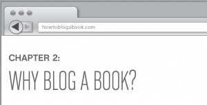
Okay, I could buy all that. That left the question of the actual illustration. One of my experts said, “That is not a picture of a blog on the cover…not a WordPress screen, for sure. Looks kind of like the Safari browser.”
 No one ever really told me what it was and I’ve never used Safari, but it is some sort of browser. I know that because my blog website address sits right there in the search box on the cover. And I stopped wondering and worrying about it when I saw the interior design and realized that on the top of every chapter the same search box appears with my blog address in it again! What could be better than that for driving traffic to a website? So, no complaints from me on the interior design, and no further complaints on the cover design.
We did have some issues on space. If you recall, when I signed the contract the publisher asked me to write more words than I proposed. And I did…and then some. Then the editor asked me to elaborate on some points and add resources, etc., as I explained in this post. While no one ever complained about the book’s length, as the book’s final design was completed, I started to hear about page constraints.
I managed had managed to garner 15 pre-press testimonials, or blurbs, for the book. (I’ll write about how I did this next week.) I was super excited about this fact, but we ended up only being able to use 10 because the design only accommodated two pages of them. Also, I landed two forewords for the book—yes, this is nontraditional (and I’ll write about this next week, too)—and these ended up needing to be edited down to one page each to make them fit. They were supposed to be blog-post sized, but still…I also had to edit my acknowledgements and dedication once or twice for space.
I’m unclear if I’ll get another chance to see the book before print. Sometimes authors do get another read through. I know the book will still go through a proofreader and an indexer.
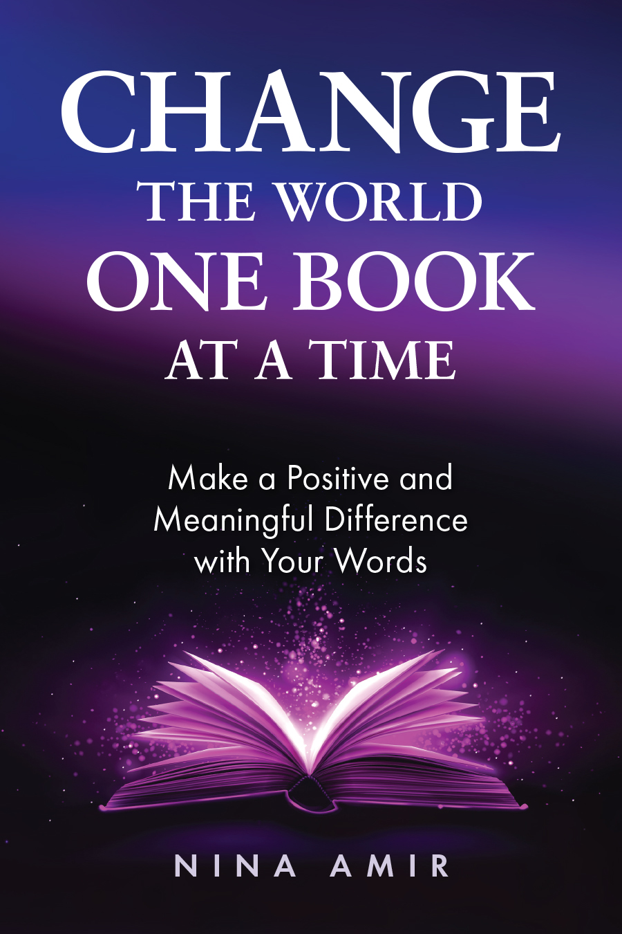
You might notice that the cover does not yet reflect the names of the writers of my two forewords.
I understand from several other Writer’s Digest Book authors that there were little thing they didn’t realize about their book design until they saw the actual physical books. So, I’m excited to hold one in my hand. This won’t happen until April. In fact, they may show up at a conference bookstore in Reno, NV, where I’m speaking before I even get one, but I hope that isn’t the case.

[…] Ready for the Launch February 21, 2012 By Nina Leave a Comment With my blogged book edited and designed and ready for printing, the forewords and blurbs all in, and everything basically in the hands of […]