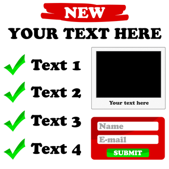
You have built a landing page to help you convert site visitors into readers, subscribers, book buyers, customers, or clients. It’s an attractive landing page, and you just couldn’t wait to share it with your target market. You expected to watch the email addresses, inquiries, and sales rolling in.
But did you receive any leads? Has anyone contacted you or submitted their email address and name to your form?
If your answer is “no,” what went wrong?
Your landing page has some flaws you didn’t notice! Fixing these is the only way you can experience great conversions. However, you are not the only one who has dealt with this technical issue. There are various marketers who fail at increasing conversions just because they made some minor but really deadly landing page mistakes.
What’s a Landing Page and Why Do You Need One (or More)?
Why would you, a blogger or aspiring author, need a landing page? A landing page provides a sales mechanism for books, products and services and a way to increase the size of your mailing list. For example, you could create a landing page to sell your new blogged book after release. Or you could create a landing page to give away a lead magnet or free resource as a way to entice visitors to give you their email addresses and build your list. You also could create one to sell a new product or get visitors into a series of value-based videos that lead to a sales page.
Create a landing page with any number of plugins or services, such as LeadPages. You then can link that landing page to your site (or to a page on your site). You also can use it with no link to the site at all but rather as a standalone web page. Here is an example of a simple lead page created to sell a product.
Keep in mind that your home page also functions as landing page of sorts.
3 Facts About Landing Page Mistakes
Here are some facts about landing page mistakes:
- Only 22% of businesses are satisfied with the conversion rates earned from their landing pages.
- If you have a slow-loading landing page, you will lose the game. A one-second delay in page loading can decrease your conversion rate by 7%.
- Studies reveal that a two-second-delay in page responsiveness may negatively affect a user’s experience by 3.8%. This means a sudden decrease in page viewing by 4.3%, according to Eric Schurman and Jake Brutlag, a team from Microsoft’s Bing.
But what are those landing page mistakes?
Besides providing conversion rate optimization tips, this post specifically identifies some critical landing page mistakes you may not have known exist. It also provides a simple solution: Fix these mistakes, get the maximum clicks on your landing page, and see your sales increase.
Let’s get started.
Landing Page Mistakes and How to Avoid These
1. Your Landing Page Loads Slowly
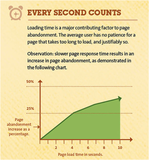
Source: GetResponse
You’ve determined your landing page is slow, but how slow? 40% of website visitors leave the website if the loading time requires them to wait for three seconds. The acceptable website speed is backed by some neuroscience research: Our brain retains visual information for 100 milliseconds.
Another study conducted by Google suggests that your landing page should have a loading time of less than 100 milliseconds to create a positive perception in the minds of users regarding your website’s instantaneous response.
How to fix long page-load time?
Eighty percent of your website’s loading time is consumed in downloading images, scripts, Flash, and stylesheets, according to Yahoo. HTTP requests are required for all these elements. To increase speed, minimize these HTTP requests. Here’s how to do it.
2. Extra Text = Clutter

Source: Unbounce
Design matters. However, adding cluttered text can ruin the entire impression of your web page. Though it is tough to avoid including value-added selling points of your product/service into the content of the landing page, the truth is that doing so actually can hurt your website conversion rate.
Keep in mind that you have only five seconds to get a visitor to stay on your website. But you shouldn’t get rid of too much text to ensure your landing page provides clear, concise, clutter-free, and attention-grabbing product information to your customers.
How to fix a cluttered landing page:
When your target audience is online, they will not read but skim everything. Communicate with them by shortening your paragraphs, using bullet points, catchy headings, bold words, and relevant images.
3. No USP at All
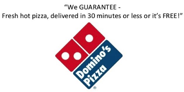
What’s the most powerful sales point of your product or service? Remember that a “unique selling proposition” or USP is what your customers look for when directed to your page. Of course, the sales point should answer the “What’s in it for me?” question.
How you tailor your USP depends on your product’s benefits, the promotion you are offering, or an appealing statistic that helps upsell your product.
How to fix the lack of a USP:
Source: Marketing Results
Analyze the benefits of your own product as well as your competitors’ products. Is there something your product can offer to your customers that your competitors’ products lack? Use these unique benefits when you market to customers. To identify the competitive advantage of your product and use it in your USP, click here.
4. Lack of Images
Imagine your potential customers visiting a website that lacks even a single image. What could be more boring?
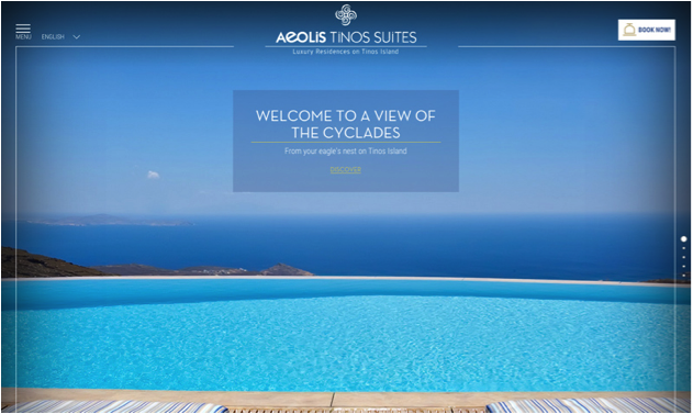
Or think of your landing page as digital product packaging. Your customers will consider your product for purchase only if its packaging is appealing. Same goes with your landing page; they will stay only if your page is filled with at least one relevant, attractive image. However, various website owners fail to comprehend the significance of inserting the right images.
How to fix a boring landing page:
Source: Educo
The image should be more than just a colorful picture. To increase the probability of conversions, add at least one image to your landing page. Besides its attractiveness, it should fulfill the following requirements:
- Communicate the purpose of your landing page
- Be in alignment with the content of the page
- Be prominent without contrasting a lot
- Be suggestive to enhance customer engagement
5. Vague CTA
Your Call-to-Action (CTA) is one of the most important elements of a landing page’s ability to drive conversions. A CTA is the actual request for your site visitor to do something, like sign up for your email list or a free item or to purchase a course. However, three main CTA issues can hinder your visitors from clicking on the CTA button:
Issue # 1: Nobody can see your CTA because it is hidden within the text.
How to fix a vague CTA:
Source: Writtent
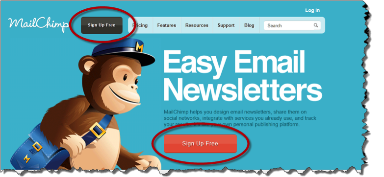
Contrast the color of your CTA button with the landing page. This will give the highest prominence to the CTA, thus prompting users to directly click on it. To get a detailed idea, check out these colors that make people buy.
Issue # 2: The CTA is not placed in the right location
How to fix the CTA location:
Rather than placing your CTA button at the bottom of the landing page (like many website owners mistakenly do), place it on the eye-level of your audience so they can take the action without any delay.
Issue # 3: Your CTA says what the visitors should do but not what they will get
How to fix your CTA message:
Again, readers search for the benefit they will ultimately receive. Here, you need to sell your CTA by highlighting the benefit they get by clicking on your CTA button. These examples will help you create a CTA that sells.
The Bottom Line
Now that you know how landing page mistakes can lead to serious conversion pitfalls, use the above-mentioned solutions solutions to optimize your landing page or other web pages. Also, always remember to keep testing the performance of your web page. Click here to track this even after making minor changes to your website.
About the Author
 Mike Dane is a digital marketing professional currently working as a PR manager at TruConversion.com. He truly loves online marketing and anything digital. He is very focused on his clients. Once he starts work, he is fully committed to his duties and responsibilities at that company.
Photo courtesy of ylivdesign.

Landing page has its own advantages and disadvantages. It could be helpful in converting site visitors into readers, subscribers, book buyers, customers, or clients and a problem when the page seems to download slowly. This innovations in online business can be the way to gain more visits in your site.